SERVICES
Brand Strategy
Website Design
Photography
Videography
Merchandise
Visual Language
Not your average membership platform
Agend has been the membership platform behind associations, non-profits, and clubs since 2004, quietly running the back end for more than 40 organisations, some with as few as 500 members, others with over 50,000. These aren't small operations. They’re communities that rely on Agend to keep renewals on track, events running, and admin off their team’s plate, so their people feel like they belong.
Typically, software and platforms with that much responsibility tend to err on the side of caution... they're functional, they're capable, but instantly forgettable. Agend, on the other hand, wanted a brand that broke that pattern, a brand with energy, a brand people actually feel something for. So that's what we helped build with them.
We started with brand strategy, sitting down with the Agend team to get to the heart of how the brand speaks, who it speaks to, and why any of it matters. That work meant untangling a business that had grown fast and built up a lot of nuance along the way, and distilling it into a foundation the whole team could build from with confidence.
With that foundation in place, the next chapter was building a visual system that could grow out of it. Not just a logo refresh, but a full brand development engagement: a refined visual identity, a complete design system spanning typography, colour, and iconography, a website redesign and a bespoke content library to bring it all to life across every touchpoint, digital and physical alike.
agend
Videography
Photography
Motion Design
A brand that doesn't take itself too seriously
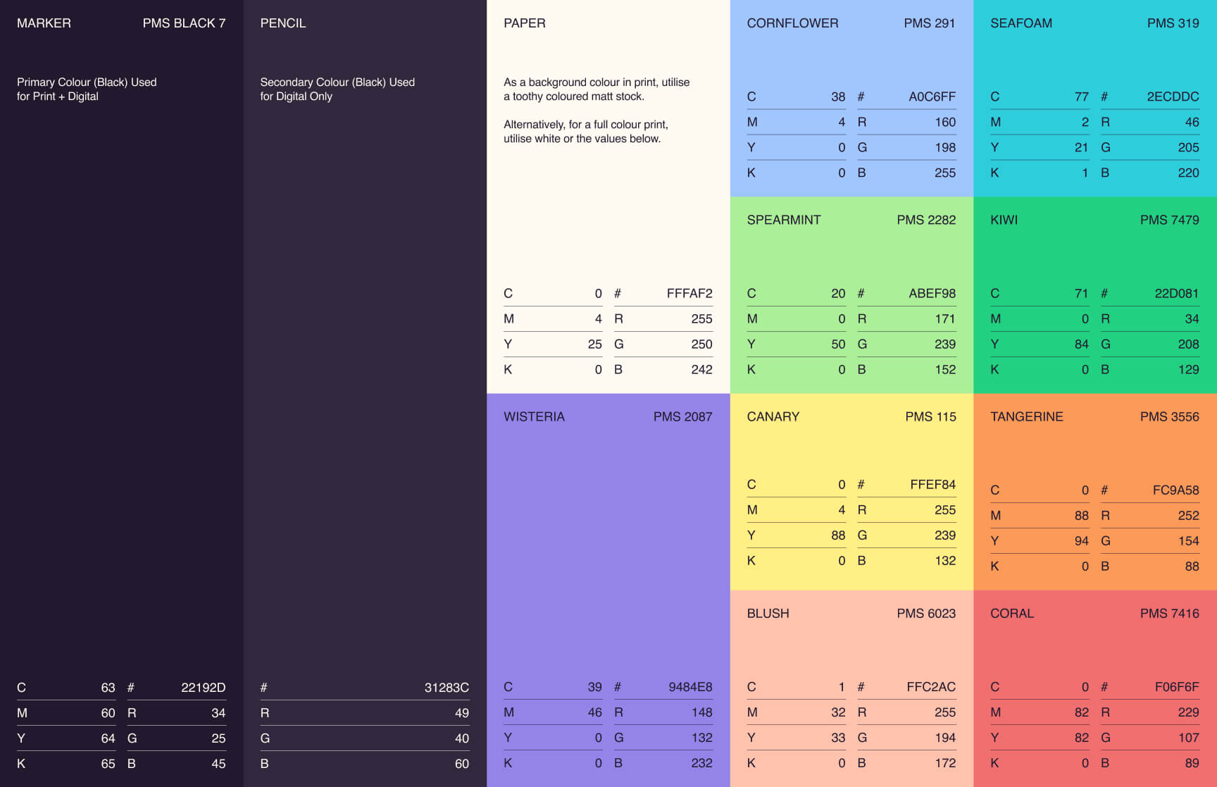
Membership platforms have a way of sliding into beige, so we went the opposite direction. Agend's brand palette is vibrant and sherbet-toned, built on cool to warm contrast for warmth and personality over corporate polish. Think box of highlighters, not typical SaaS. We leaned more pastel with every hue (spearmint rather than neon green, blush instead of hot pink), which keeps the whole palette energetic without tipping into loud.
Alongside it, a signature highlighter stroke, hand-drawn underlines and callouts that mimic the act of marking something important, became a recurring motif across the brand. It's a nod to the small, human routines of membership, ticking off a renewal, flagging an event, circling a date that matters. It's a small device, but it does a lot of work, drawing the eye to what matters and giving every touchpoint a sense of personality and momentum.
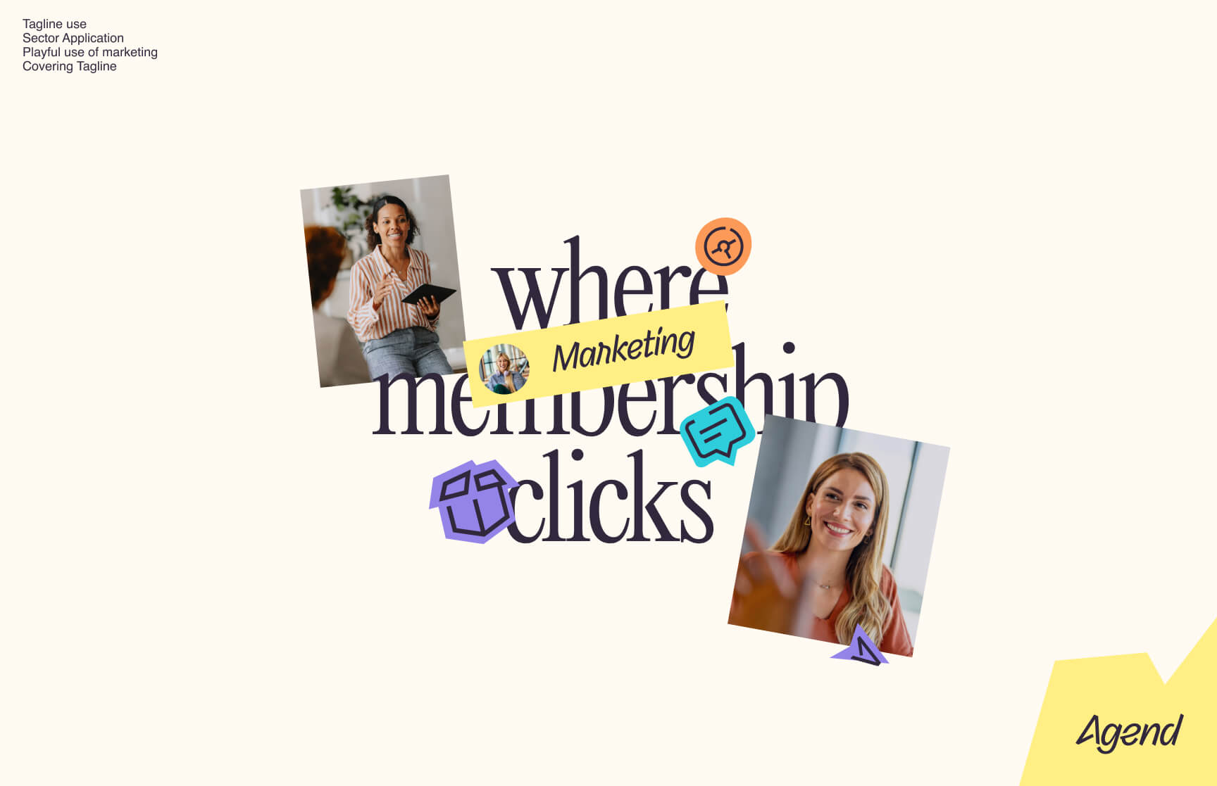
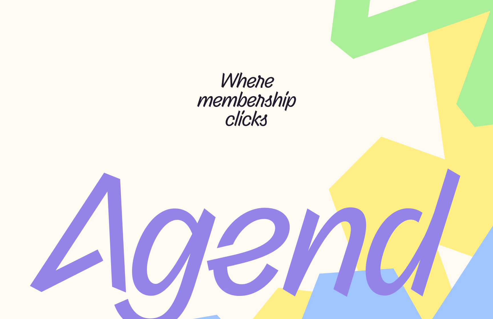
The logotype takes its cue from the product itself, a nod to the click at the heart of every digital interaction, with a mark that curves like a signature but clicks like a cursor. The tagline set carries that same double meaning: "Where Membership Clicks" speaks to members, the ease of a platform that just works; "Supercharge Your Team" speaks to the admins and organisers keeping it all running behind the scenes.
Beyond the core identity, we built out a complete iconography system: a minimum of 25 custom icons covering product UI, marketing, and communications, supplied as SVGs in an organised library so the Agend team can keep building with the same visual language, consistently, long after the project wraps.

A website built to sell
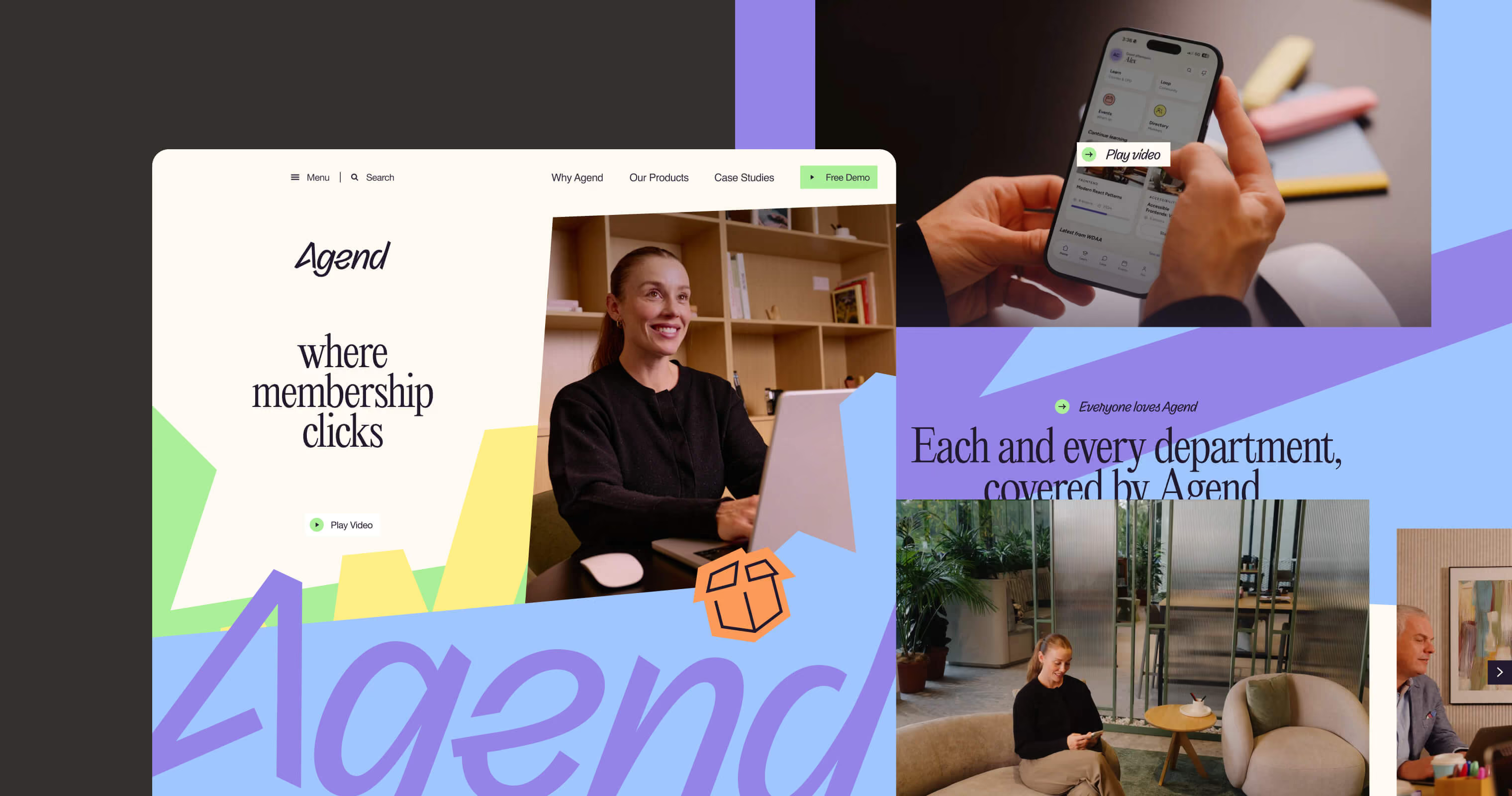
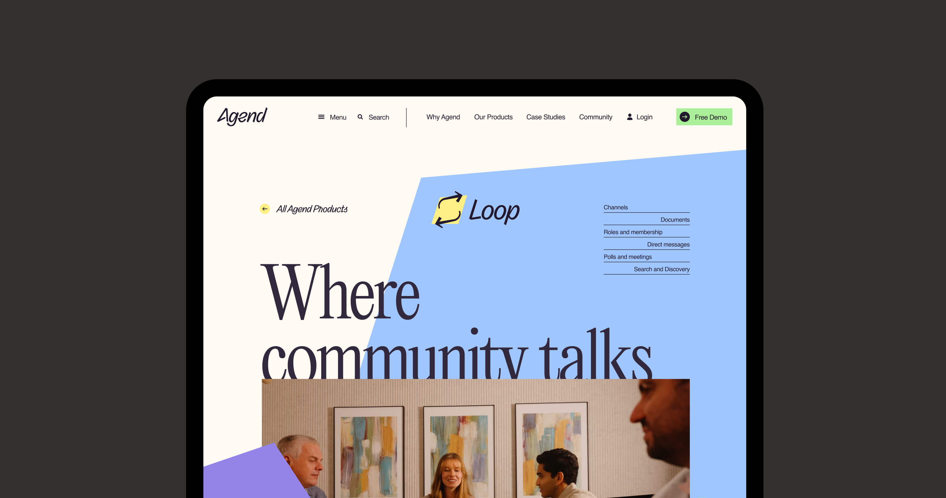
With a suite of association management products market ready, Agend needed more than a brochure. They needed a website that worked as an active sales tool, and one that felt like the product behind it.
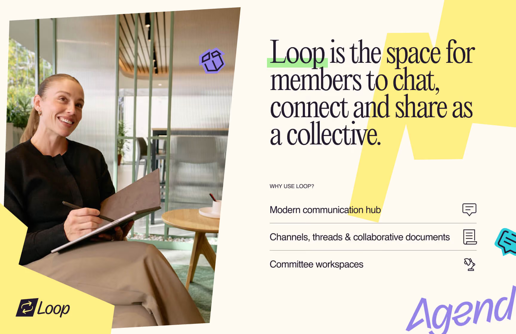
We designed the new site in Figma, starting with a strategy workshop and a full sitemap shaped around how Agend’s customers research and decide, then moving through wireframes, a clickable prototype and a library of reusable page components. Agend’s own web development team then built it. The result is a clear, conversion-focused site that carries the brand through bold headlines, colour blocks and real photography.
Read the full Agend website case study.
agend
Website Design
A content library built on real relationships
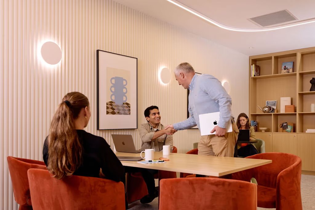
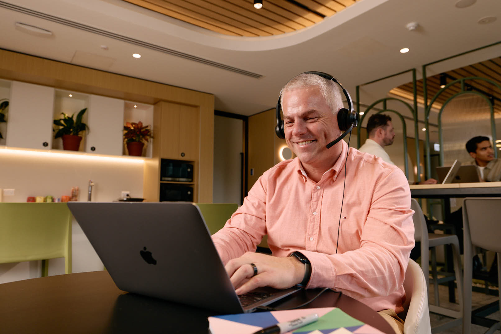
Behind every membership is a real relationship, and stock imagery was never going to do that justice. Agend's clients live in a specific world, one built around community and keeping organisations connected. Customers can tell when content is generic and wasn't made for them.
So we directed a bespoke, standalone content shoot with a single objective: create imagery that Agend's clients would recognise themselves in. Not a templated or reactive approach, but a fully considered process, starting with understanding Agend's world fully, aligning on objectives, audience, and creative direction, then curating the right blend of talent, location, and styling to bring a genuine "day in the life" of a real Agend user to life. Once, and well.
The result is a content library fit for purpose: a suite of imagery and video that reflects Agend's clients as they actually are, authentic, capable, and confident in the tools they use. Assets that speak directly to the organisations still searching for a better way to manage their members, and make them feel understood before they've even reached out.



agend
Explainer Video
Four conferences, one consistent brand
A brand isn’t finished once the guidelines are signed off. It has to hold up in the real world, under bright conference lighting, on a crowded exhibition floor, and in the hands of people who’ve never heard of Agend.
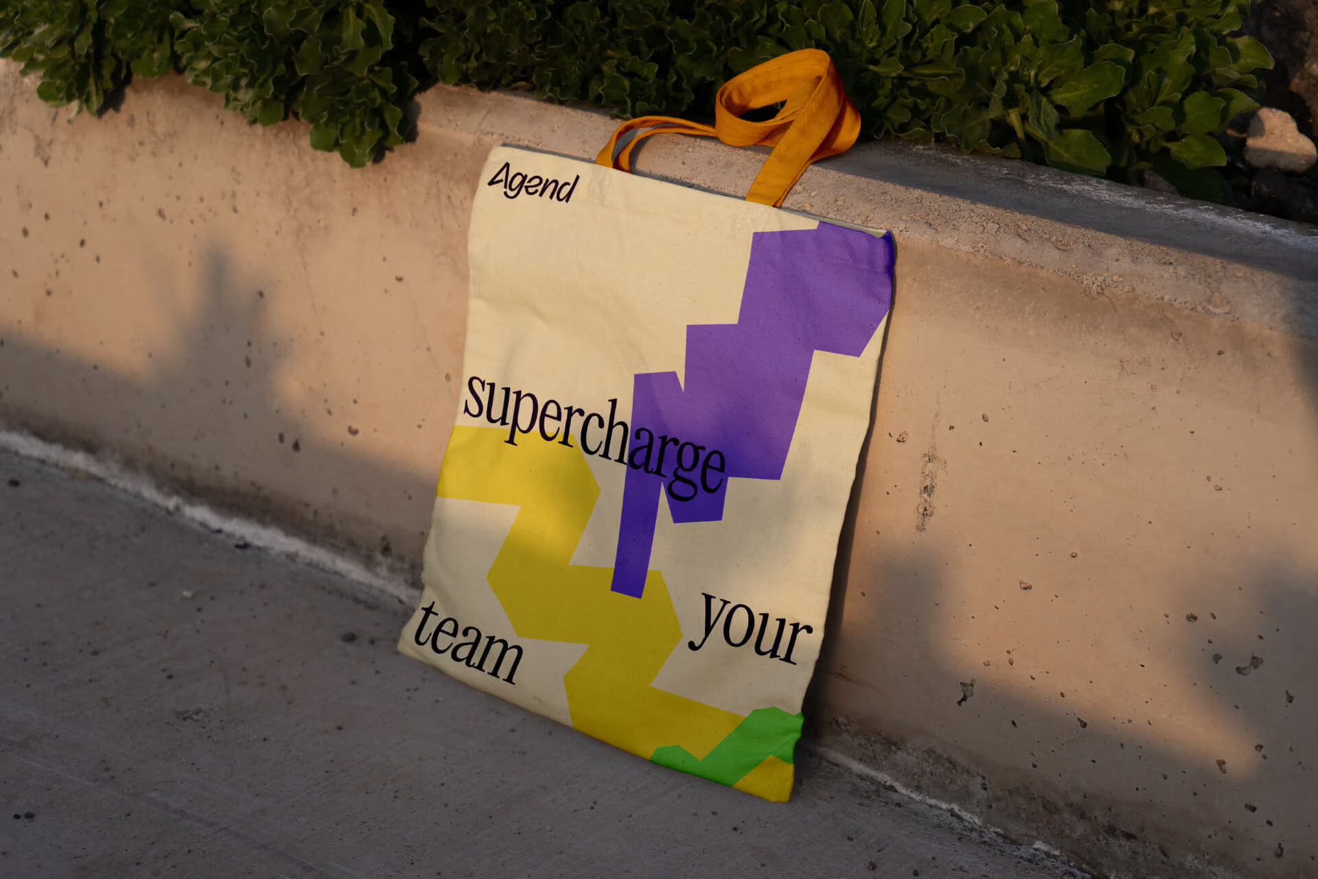
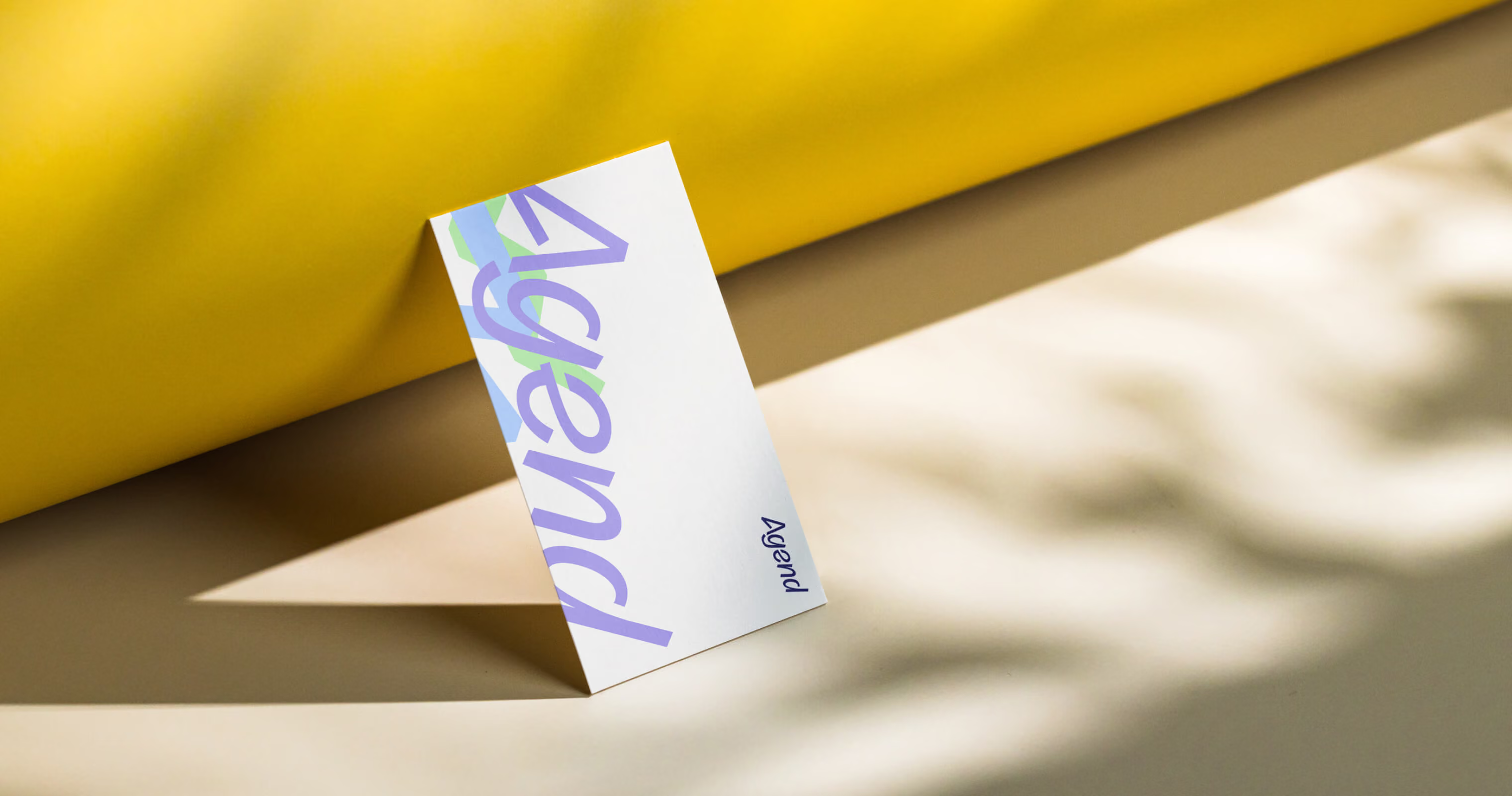
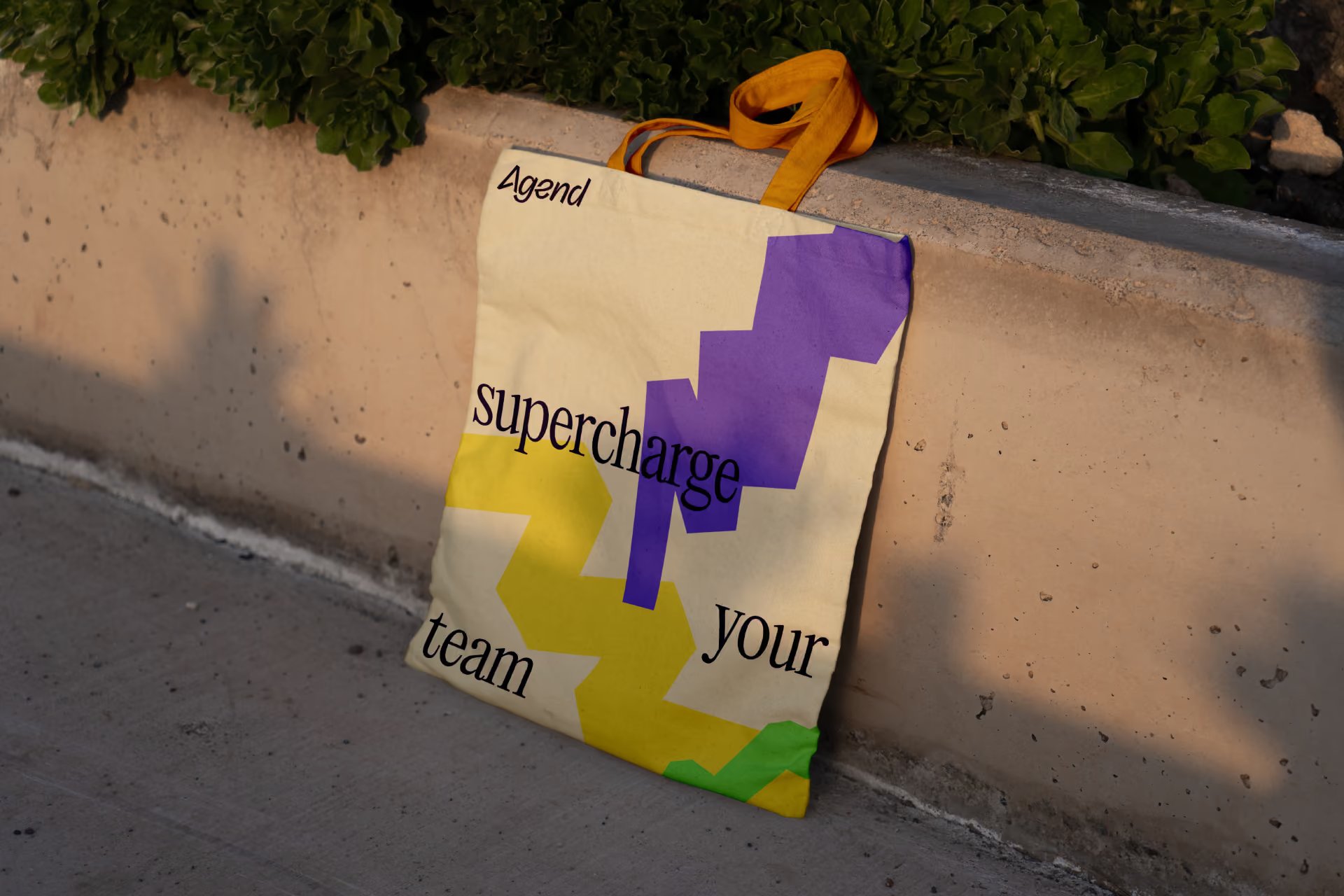
Across a five-month stretch, Agend had four conferences to show up at, and we produced the collateral for every one of them. The first phase of the project was built around having a working brand toolkit ready in time for the first event, so the brand met its audience early and the system was refined as it went. The stall signage did the heavy lifting, using the palette and highlighter strokes to stop people mid-aisle. Branded calico bags gave conference goers something useful to carry around all day, and business cards carried the logotype into the hands of every new contact. We also built a showreel for digital screens, bringing the content library to life with movement and keeping the stand busy even when the team was mid-conversation.
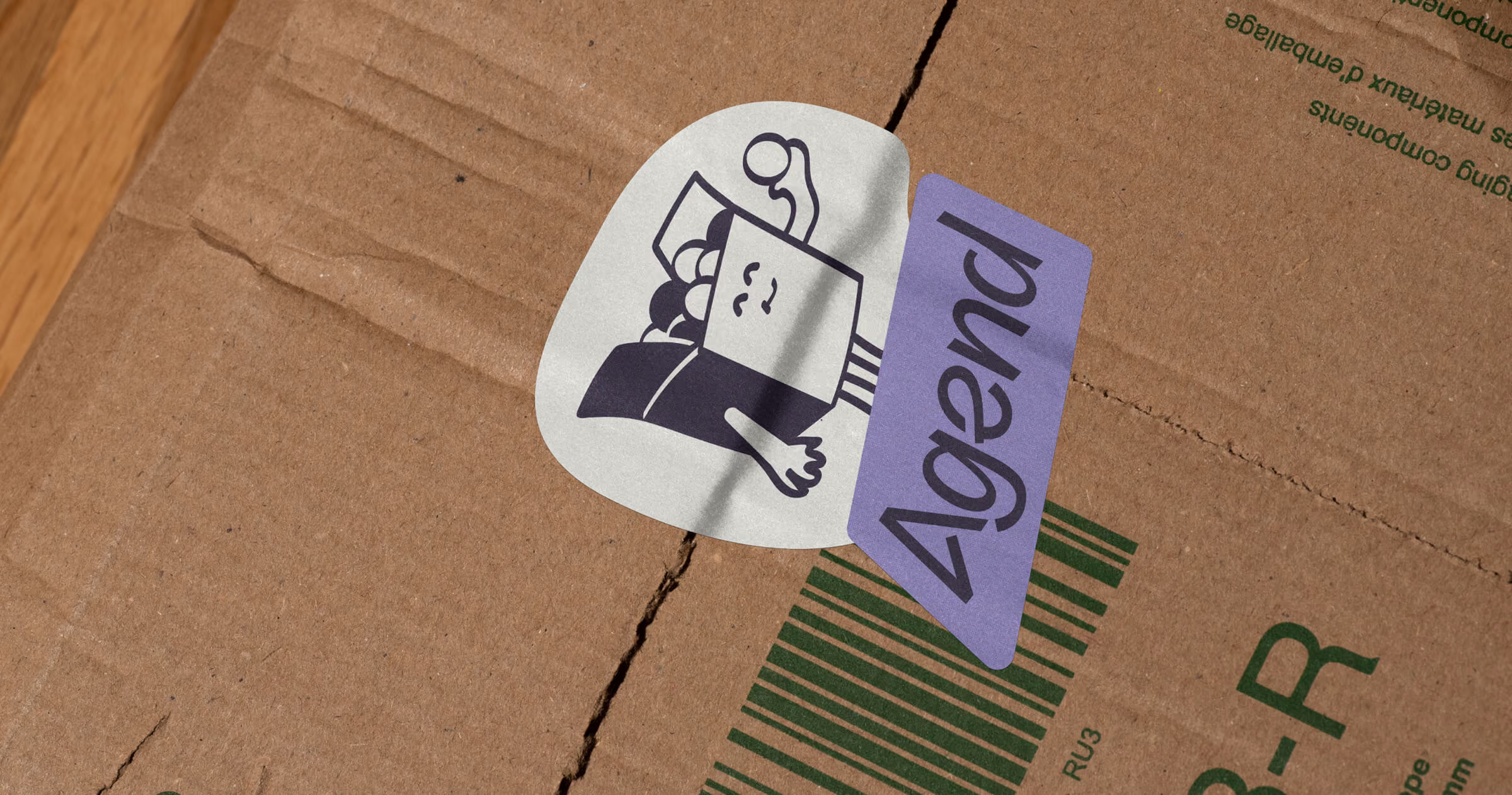
Because the brand was designed as a system, each event was easier than the last. The team wasn’t starting from scratch each time, and every piece looked and felt like Agend, whether it was a stall banner or a sticker on a cardboard box.
agend
Merchandise
One system, ready to build on
Brand strategy, visual identity, iconography, website design, content, and event collateral were all developed as one connected system, rather than a series of separate deliverables. That’s a deliberate choice. When each piece is designed in isolation, a brand starts to drift. The website says one thing, the conference stand says another, and the team spends its time smoothing over the gaps.
Here, every decision traces back to the same foundation. The strategy shaped the voice, the voice shaped the identity, and the identity carried through to the icon library, the website layouts, the photography, and the printed collateral. From the angle of a highlighter stroke to the copy on a conference tote bag, everything pulls in the same direction.
It’s also built to keep going once we’ve stepped away. Alongside the brand guidelines and toolkit, we handed over the Figma files, the SVG icon library, and the content shoot imagery, so Agend’s team has everything they need to build on the brand themselves. They can keep working in the same visual language without reinventing it each time.
The result is a brand that’s finally as considered as the product it represents, and one that Agend’s team can confidently grow with.